Project: Media Partner Digital Asset Management(DAM) System Redesign
Company: impact
Role: wireframes, high-fidelity ui, interactive prototype for usability testing
Industry: SaaS
About Impact
Impact also previously known as Impact Radius is global leader in cross marketing attribution. Impact enables digital brands and agencies to maximise their return of ad spend across digital, mobile and offline channels. The company Saas marketing technologies enable markers to have a singlular trusted analytics view into marketing efforts by collecting granular consumer journey data and marketing cost.
The Problem
As partnerships drive a shift in the digital marketing world, the needs of brands and the ways they communicate with their audiences need to shift with it.
Different partners need different types of content, and not all of it falls into the category of traditional banner ads. For example, partners in a brand-to-brand program might need co-branded assets in their marketing.
In contrast, influencers need social media-ready content to post to Instagram, while traditional affiliates require a text link to embed in their content.
The Solution
Redesigned the user interface and implement a digital asset management system to set up partners for success.
To support the diverse partnership types on the platform, impact.com expanded its system to include a wide variety of assets, including those that:
- Assist partners sell products, which might include co-marketing one-sheets or even sales decks
- Educate partners on new offerings or improvements, such as ebooks and guides
- Help partners position the referred products, such as with email, social, and campaign copy
- Assist partners in visualising their products in the best possible light, such as .gifs, .jps, and videos
- And, of course, traditional ads and links
Essentially, the digital asset management system provides access to a wide array of resources and assets while ensuring partners get the information that best suits their unique needs
We engaged with product team to articulate their needs and help understand the basis behind them. At this stage, i’ve learned more about the current product version, branding, users, and their workflows.
Auditing existing designs
Gathering ideas of product improvement, we proceeded with conducting an audit of the existing designs. The issues we identified were then prioritised and scheduled to be worked on. We worked on improving the existing design components and visual design, reducing cognitive load and better usability.
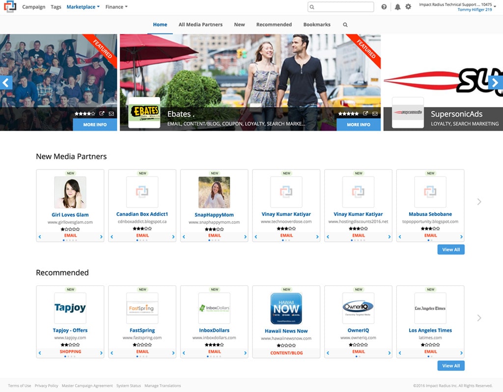
Marketplace


Low-Fidelity Wireframes
Based on the main features, task flow and onboarding of the impact platform, I created initial sketches & wireframes. I used Balsamiq as the tool for Low-Fidelity prototyping the app.
Influencer Signup

Onboarding

Onboarding

Dashboard

Content

For each major shift in design, we’ve conducted internal and external interviews with potential users, media partners, influencers and other stakeholders. Who we talk to depends on the feature we’re designing. That’s how we knew whether our designs worked.
Usability testing sessions, allowed us to identify potential usability issues early on, which made it quick and cheap to fix. Beta testing is yet another way we used to validate our design decisions through gathering quantitative data.
High-Fi Design
The next step for a validated wireframe is making it look stunning. That’s what we put our effort into. These designs were then turned into hand-off files for the development team.
There were developers working on the project already, so there were a lot of things running in parallel. At any given point in time, developers had things to do, and so did we. That’s one of the other benefits of the agile design approach.
Marketplace

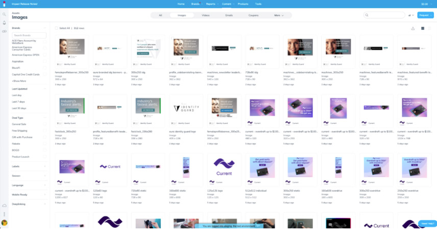
The DAM’s new interface uses a grid format to put the asset front and center, giving users a better view of the various types of assets available. Partners that look for a specific type of content can easily narrow their search by choosing between images, videos, emails, coupons, and more along the top of the page.
Once partners find an asset that suits their needs, it’s simple to find out more. Partners access all the information about the asset with a click in an easy-to-read sliding panel. Partners can then download the asset directly and grab a tracking link or turn it into an ad unit.
Sliding Panel

The redesigned system provides users with more information than ever before in a quick, at-a-glance format. Partners can now see the actual dimensions of an asset, file size, and more. What’s more, partners can find everything they need to put the asset to use, including:
- performance data,
- embeddable ad code, and
- simple tracking links.
With this information, partners can quickly find and implement the content that best fits their needs.
Sign Up

Email Verification Modal

Onboarding

Some things change; some stay the same
The new redesign in the Digital Asset Management (DAM) primarily affect the partner experience. The brand side of the platform will largely stay the same for now.
Example: If partners prefer a list view, they can return to a version of it by clicking the icon in the upper right corner. Users who choose this view can still enjoy the new features by clicking the “view details” button or the row itself.
Putting the DAM system to use
The expanded capabilities of the DAM system provide partners with a wider variety of assets. Similarly, brands need to hear about any unmet content needs their partners may have. Brands need to proactively engage with their partners and ask which assets and educational material would be most beneficial to them. Partners should also feel comfortable reaching out to request assets and materials that will empower them to do their jobs better.
Evolving features keep the impact platform and its users leaders in the partnership economy.