Project: Wealth Migrate Platform Redesign
Company: Wealth Migrate
Role: research, wireframes, high-fidelity ui, interactive prototype for usability testing
Industry: FinTech
About Wealth Migrate
Wealth Migrate is a leading Fintech real estate investment platform established in 2010. They make investing in high yield, institutional quality, first world real estate accessible, safe and affordable for anyone online.
The Problem with Investors
Real Estate investors are recognising the power of real estate investing using technology, but do not have an easy and safe way to invest in real estate markets globally – residential or commercial – and diversify.
The Problem with the Existing Platform
We detected certain frictions in our customers’ first experiences with the product, which resulted in a suboptimal profile verification rate. That is, from the total number of users who signed up for the product, many never completed their profile verification.
The Solution
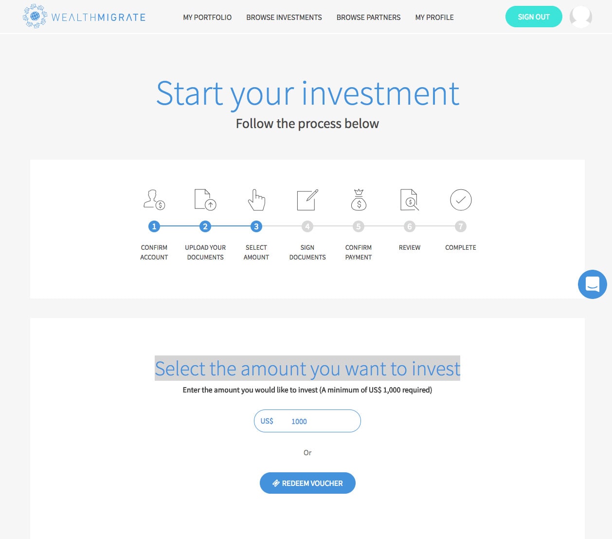
The idea is to change the user flow to run through structured steps and guide the user from the moment they sign up until their profile is approved and investment has been completed.
Streamline on-boarding
Ultimately, the sign up, KYC (Know Your Customer) profile verification and investment process will be streamlined.
- Create an intuitive and action based email platform
- Create Setup flows and in-app for first time users and new features
The Design Process
We followed a UCD approach to make sure that the design decisions were supported by user research and feedback.

Kick Off
The project manager and I kicked off the project by running a few UX workshops in order to gain a deeper understanding of the problem, the users and the broader product strategy.
Throughout this process, we made valuable discoveries, such as the following:
- Some users pointed out the profile verification(KYC) process was to long.
- Users also did not have there verification documents at hand, such as there Identity document or ID book, proof of residence and bank account documents.
- Users did not know after there profile was verified that they had to fund there wallet to make an investment.
- Users was also not aware of the risks involve in investing
Defining the problem
The first step in solving the problems we had to define it. In order to do so, we decided to interview people from the Wealth Migrate user base who had signed up but never made their first investment.
These workshops, all held at our offices in the Woodstock Exchange, included a goal-setting session to make sure we were on the same page in terms of high-level direction and objectives; a persona workshop to understand the target audience, and a user journey workshop to map out our hypothesis concerning the main pain points users were facing.
We asked them about the reasons why they signup in the first place, the expectations they had, their first impressions, and overall experience with the product. Additionally, we asked them to walk us through the platform and show us what they understood, what wasn’t clear, what they liked, and what frustrated them.
Furthermore, we also conducted user tests with the existing platform, testing people that corresponded to Wealth Migrate’s target audience but who had never used the product before to get a better sense of the problems that may arise when using the platform for the first time.
This helped us complete our user journey with real data and observations, and allowed us to easily identify the main pain points in that journey and create a clear roadmap for the project.
Personas
To start off, the product manager and I created personas of potential Wealth Migrate users based on our understanding of investors who were on the platform. This persona was created with assumptions and not fully research-based but it was something that I came back to throughout my project to guide my design decisions and priorities.
Competitor Analysis
While our product manager was busy with the previously mentioned discovery research, i studied Wealth Migrate’s competitors to see what each of them was doing differently, gain a better understanding of the market and gather inspiration.

Ideating, prototyping and iterating
Together, the product manager and I ideated on different approaches to solving the problems at hand before agreeing on a direction.
User Flows
To help us visualize and identify the different elements of the process, and the interrelationships among the various steps, we used the diagram flow (created for MVP) as a graphical representation.
Low Fidelity Mocks
The first low-fidelity prototype was then created with Balsamiq.
Sketches
After completing out initial research, I sketched ideas. This allowed me for many iterations through varying design options.
High-fi Design & Hand-off files
The next step for a validated wireframe is making it look stunning. That’s what we put our effort into. These designs were then turned into hand-off files for the development team.
There were developers working on the project already, so there were a lot of things running in parallel. At any given point in time, developers had things to do, and so did we. That’s one of the other benefits of the agile design approach.
Styleguide
A styleguide was created that reflects the new corporate style and ensures brand consistency with design, development and writing.


